For my advertising strategy I was thinking that I could promote the products in a high end magazine's like Vogue, Elle, Marie Clare, Cosmopolitan, Glamour as these are the typical magazine that you would see them in.
As these are the adverts for bags that are shown in current magazine's even though they are adverts for the magazine's this just shows how much money they put into promoting there products, which I think adds to the value of the products. Normally for a luxury brand they have a two paged spread which would be very expensive to do but again this just shows how high end this brand is.
I think this image here of the bags is a good way to advertise the new products. I could also do a billboard, web-site's.
I like how simple these billboards are and how the logo is one of the main focuses I also think the white background works well with the images. I think this is just a good way to promote a brand as it's simple with not a lot of information on it.
Like this image:
I think this has a lo of information on it and people wouldn't really take notice of this where as if it was a clean cut image and logo people will get the message.
So for my design's I wanted to do something simple and to focus on a few products so people would know that Mulberry have a new product range.
 |
| Billboard 1 |
 |
| Billboard 2 |
These are my ideas for the billboards for the new products, I think these a quick simple and easy to get the message across without being to complicated. I wanted the effect of a reflection to give it a more life like feel to it, I also like the fact that the reflection gives a glossy surface effect which I like.
I wanted to keep the logo of to the side as this just gives it a touch of the brand without being over the top. I also like the idea of using this technique for a website design?
Billboard 1, I wanted to show a link to the bags with the new product and this is the idea I came up with. I think this works really well as every woman carries at least one or both these products in there bags and this is just a good way to shows how a women pampers herself.
This image here I thought could be a good advert in a magazine for say Cosmopolitan or any other fashion magazine that a women would read. I think this would be a good two page spread, again it's simple and shows what the product is for and also the new logo is shown to inform people that Mulberry have developed it's brand.
You could also show other products this way so the shampoo and conditioner can be shown in the shower of the candle could be shown on the side of the bath. Just to get the impression of the idea's behind the new products, to pamper yourself.
Website
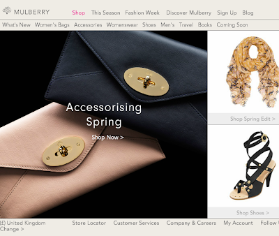
This is the current website for the brand, I have the idea of using the same layout but changing it slightly but keep it so it's an extra link onto this site.
 |
| Image 1 |
 |
| Image 2 |
Here you can see what I meant by keeping it the same but updating it to fit in with the new products. I obviously changed the logo to the new essence of mulberry logo, i'v also kept the same top bar the same but added 'Mulberry bags' to the top so this will be the link to the original website. I then added on the other lines other information to link to the new products such as travel products.
I played around with the layout of the text but kept image 1 was the design as I thought this was readable to looked neater than image 2 just because I felt it looked more professional.
Here is my finished website I added the image's with the reflection as I thought this gave a more professional finish also keeping in touch with the original website. This is what the rest of the sections would look like and each product would be shown this way along with the link to the original handbag website. This would be updated as new products would be made.
I could see these idea's being used to promote this new product as it's tasteful and not to overdone either which is a good way to start a new product off. Obviously the bag advertising is a lot bigger and over the top but this is a new product and new concept so it's going to be a bit smaller.
Overall my advertising strategy is that the website will be updated and advert's in magazine's along with billboards. I think this is a good choice for the new products as I don't want the advertising to become tacky I wanted it to stay high end overall. I also wanted to keep the advertising simple and professional as this is what it is originally, so you can see what the product is and the idea behind it i.e. the bubble bath and bath advert. As the product grows the more extravagant the advertising will get i.e. using celebrities maybe even a T.V advert that shows certain products like shampoo.


